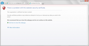
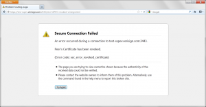
So today I have done posts on the browser user experience for expired and untrusted certificates but we wouldn’t have proper coverage on the topic of bad certificate user experience if we did not cover revoked certificates.
VeriSign is kind enough to host a test site that uses a revoked certificate (I know we do too I just can’t find it right now) so we will use that (https://test-sspev.verisign.com:2443/test-SSPEV-revoked-verisign.html)
Again what we want to see here is:
- Users are warned or prohibited from going to the site in question.
- The warning language used is easy to understand and explains the risks.
- The warning language used is related to the fact that the certificate is expired.
- The trust indicator does not show or is marked to indicate that there is a problem.
In this case I think again Internet Explorer and Chrome do the best; The worse experience is in Opera as it leads the user to believe there is a connectivity problem unless they expand the error message.


